


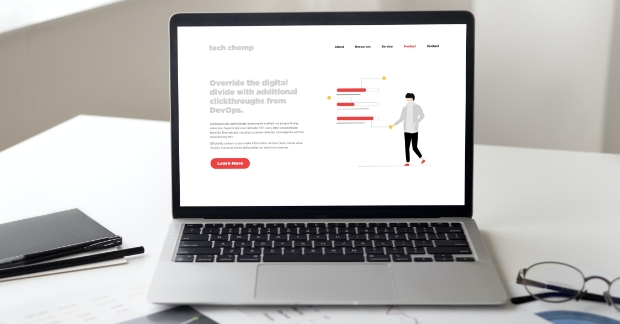
A website is usually the single biggest marketing asset that a B2B tech marketing team has available to theme. But sadly, it’s often the single biggest missed opportunity as well!
A common issue we’ve seen time and time again when it comes to B2B tech websites is that it’s not designed with the user in mind and not designed to drive marketing activity.
You’re worried your site might be guilty of these issues, aren’t you? Well don’t be! We’ve outlined seven common missteps with B2B technology websites and how marketers can make them more effective!
Issue #1: making it too difficult for the user to find what is most important to them
Websites have certainly evolved from being simple “electronic brochures” to being full-fledged marketing systems, and with the rise of inbound and content marketing, it’s becoming even more important to drive all of that traffic to relevant information.
No matter how someone first lands on your site, such as a blog post, clicking an ad or directly landing on the homepage, having a clear path for visitors to flow through on your site is super important. It impacts everything from conversion, message comprehension and overall user experience.
Ever wonder why your site traffic is growing but your conversion rates and overall ROI is staying flat? Your site might be confusing users and not driving them to action.
Tip: Make it easier for your audience to progress through your site with links, calls to action, downloads and contact forms.
Issue #2: poor use of color
Color is so important in web design! Your site should use colors that are representative of your brand profile and that are easy to see on a screen. It’s also a good idea to use more than just one or two colors on your site - such as having different color type for hyperlinks, buttons, and other on-page elements. That said, try not to go overboard and use too many colors just for the sake of using it.
Of course it’s important to make sure the colors on your site are on-brand, but did you also know that color can affect how people interact with your site?
For example, color can impact conversions and button clicks, as was found in this case study by ConversionXL.
Tip: Use Adobe Color CC to learn more about color theory and what colors compliment one another and can enhance your website.
Issue #3: bad CTAs
Calls to Action (CTAs) are one of the most important elements of a marketing website. A CTA can take shape in a variety of ways -- graphics, hyperlinks, contact forms and buttons are CTAs we’ve all seen used before. Why are they so important? They are one of the simplest ways to convert a site visitor into a prospective lead.
What makes a good CTA? There are a few things to keep in mind?
- Make your value proposition easy to understand
- Design your CTA in a way that is eye catching
- Make contact forms as simple as possible - only require that visitors complete fields that are absolutely critical for you to know.
Issue #4: making text too hard to read
Sometimes, one of the most fundamental aspects of a website is overlooked: readability! Going overboard on “designy” things can make a website harder to read and understand what is going on.
Design no-no’s for readability:
- Using a dark font on a dark background (or a light font on a light background)
- Making your font size too small (our website uses 16pt font for body copy and 32pt for headings) … big font makes it easier on the eyes!
- Smushing your text too close together … give it some breathing room!
Tip: See how your site stacks up with a web accessibility checker like WAVE.
Issue #5: ignoring mobile users
Mobile users are still being forgotten by a lot of B2B technology sites, which is surprising because mobile internet usage surpassed desktop in 2016.
If your site doesn’t scale down nicely for mobile users, or if you are still (gasp) using Flash, it is definitely time to revisit your site strategy.
Remember that mobile users are OK with scrolling, but that long-form text can be intimidating on websites. Make use of lists, ordered content, and great headlines to make it simpler for mobile users to follow along with your content.
Issue #6: overuse of interactive content elements
Interactive content elements are things like sliders/carousels, accordions, flip-cards, etc, that are used on a site to drive user engagement and interaction. Content elements like these are a really smart way to increase comprehension and conversion on your site. Why? They get users to interact with your content and actually read it, not just skim over it.
But sometimes marketers go a little overboard and start using them for everything - which can fatigue a visitor and make it so they don’t actually read your best content before bouncing off the site.
This isn’t to say that a website should never use interactive content elements, just that overuse of them can make a website confusing and hard to use. When planning out your content strategy and design, keep the user in mind - is hiding content behind interactive content elements a burden to them, or will it help make a pleasant experience?
