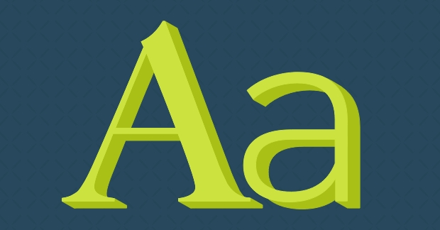
Confused by typography lingo? Here are some basic definitions to help you communicate with your graphic design friends (like the type dweebs over here at Kiwi Creative!) without sounding like an idiot.
Serif vs. sans serif
Sans means “without” and serif means “foot.” Telling them apart is as simple as that! Traditional serif fonts read faster because the small feet make the letters connect better whereas the more modern sans serif fonts are better viewed at larger sizes to make an impact. For that reason, designers often prefer serif fonts for body copy and sans serif fonts for bold headlines.
Tracking vs. kerning
Even designers get this one mixed up. Tracking is adjusting the overall letter spacing for groups of letters or entire blocks of text; it is used to lengthen or shorten large blocks of text to improve hyphenation and line endings. Kerning, on the other hand, is adjusting the space between pairs of individual letters (see the space between "v" and "a" in the above image); designers adjust kerning between individual letters when auto-spacing causes two letters in a word to appear unnaturally close or far apart.
Leading
Leading refers to the spacing between lines of text. The default setting for line height is 120% the size of the text (ex; 10 pt. type = 12 pt. leading), but this may be adjusted to improve clarity or give hierarchy to the text.
White space
While white space doesn’t necessarily have to be white (it could be a large empty area in a photo or a solid block of color), it does refer to leaving some “breathing room” in a design. (No need pack your ad with text or enlarge your logo to gigantic proportions just to fill up “extra” space.) Sometimes less really is more.
Font vs. typeface
Typeface refers to the entire family of a particular font. So if we are talking about Helvetica in all its forms (Bold, Italic, Ultra Thin, etc.), it would be called a typeface. If we are referring to a specific version within a typeface, we would call it a font (ex; Helvetica Neue Bold).


