


You just sent out what you thought was the perfect marketing email; Killer subject line, witty copy, and a compelling CTA. You proudly send it out to your contacts and go on with your day. Fast forward to the next day, you check your email stats and see that your email is performing terribly. Open rates are down, conversion and click-through rates are slim to none, and the graphic designer is giving you funny looks from across the office. You have really messed up now.

Writing quality copy, subject lines, and CTA's is only half the battle when creating marketing emails. Design plays a large role in enticing the prospect to continue reading and interact with the contents of the email. The average business person receives and sends 121 emails every day, so it's essential to do everything you can to stand out. We will discuss different ways to design emails for better results.
Making your email picture perfect
Using pictures and graphics is a great way to make your email visually appealing. Follow this checklist to make sure your images are meeting technical and visual standards:
- Add a hero image or header graphic to your email. This may be a branded element or an attention-grabbing image. It’s critical that this image is not distracting from the messaging.
- Stick to 3-5 images depending on the length of your email. And try to keep them on brand!
- Use a file format that is acceptable for common email browsers. The most common file types include JPG/JPEG, GIF, and PNG.
- Add Alt text! In the unfortunate case, a viewer has trouble downloading images; alt text is essential for accessibility.
Let’s talk layout
Once you have selected images for your marketing email, now it’s time to design a layout. There is a bit of science behind creating the structure of an email.
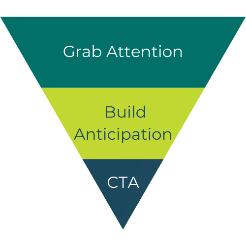
A common practice is to follow the inverted pyramid. Start with an eye-catching headline, then build anticipation with informative details, and finally, add a call to action button. Using this method to focus the layout around the CTA will encourage the reader to take action.
Take a look at these additional best practices to designing an effective layout:
- Short and concise text blocks: Humans don’t have the attention span to read long paragraphs of information. Organize your copy in short paragraphs or bulleted lists.
- Format text and images side-by-side: Aligning your copy with a relevant image will help break up the content, making it easily skimmable.
- CTA’s following each major section. Be sure to prompt the reader to take action after reading each main idea. Make sure the CTA button is under the corresponding text.
Deliverability and design
Don't you hate it when you miss an email because it went to your spam folder? Well, It turns out there are several reasons that could happen. Email deliverability is the rate at which emails end up in the contact's inbox instead of being dumped into the spam folder.
Many technical factors go into this metric but design also plays a key role in email performance and engagement. From a design perspective, the issue with deliverability is almost always image file size. Large image files lead to large email files, which could land your marketing email in the dreaded spam folder.
To prevent your emails from ending up in the spam folder, try compressing your images using a free image compressor like imagecompressor.com. This tool will reduce the image's file size by 50-90% while maintaining its quality.
Mobile scaling issues
Did you know that 85% of users check their email using a mobile device? And 70% of users will delete an email if it's poorly formatted. Designing emails that scale to all screen sizes is crucial.
Depending on the program you are using to create your emails, you may already have the option to build a mobile version. If this is you, take advantage of that feature so your emails look beautiful on all devices. If you don't have the fancy software, don't worry. You may have to spend some time testing and adjusting emails on a mobile screen.
Here are some things to consider:
- Move key elements towards the center of the design to avoid getting cut off.
- Above, we talked about formatting images and text side-by-side. Don't forget to test how these blocks adjust on a smaller screen. Do they stack? Are they still side-by-side? And if so, are they large enough?
CTAs: buttons vs. images
If you're practicing the inverted pyramid method I mentioned above, you're going to want CTA's sprinkled throughout your email. Here are two ways to create CTA's:
Buttons
CTA buttons are a simple yet effective way to get the reader's attention and call them to take action. They take minimal effort to create, and no designer is needed. A quality CTA button has a compelling copy, contrasting color, and is surrounded by white space to make it stand out.
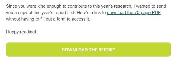
Images
Image CTA's are a perfect way to combine your text CTA with imagery. A CTA button is often designed into an image, but clicking anywhere on the image will take you to the page. These are often banners that span the width of the screen, as seen below:

Note: Neither of these is better than the other. Choose what looks and performs the best. Run A/B tests to find out what works best for your audience.
Font decisions
While you may be tempted to use that cool font you downloaded, you probably shouldn't. Using fonts that are not "web-safe" often won't show up on the reader's end. While these fonts will get converted to a default web-safe font, it's better to choose a web font to use from the beginning and with consistency.
Check out some of the most common web-fonts:
- Arial
- Verdana
- Georgia
- Times New Roman
- Courier
Test, test, test
No email is complete without running tests. Your unique email design could appear differently across email service providers like Gmail or Outlook.
If you rely heavily on email marketing, we recommend setting up a test list consisting of fake email accounts from various service providers. View them on desktop and mobile devices to make sure photos and designs are present and aligned, and nothing is cut off.
Testing your emails on a mock email list is a great way to test how your clients or prospects will see the emails before they even go out the door.
