


Creating a single piece of content in the B2B tech world can be a massive undertaking…from building a content strategy, to wrangling subject matter experts for copywriting assistance, to proofreading …again and again and again. But now that you have an awesome sounding piece, it’s time for your friendly neighborhood graphic designer to step in and create an awesome looking piece for your software or technology company.
To accomplish this, one of the most important tools in a designer’s creative arsenal is white space.
But what does white space even mean?
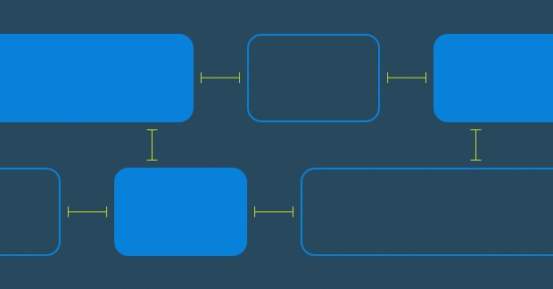
First off, it’s not always “white”—it’s simply the design term used for negative space, the “breathing room” between layouts, lines of text, paragraphs, different UI elements and so on.
Think white space is just an artsy fartsy term graphic designers and UI/UX professionals like to use to sound smart? Think again…white space has proven psychological benefits that will improve the effectiveness of your tech content.
White space improves comprehension.
Studies indicate that proper use of white space between lines of paragraphs and its left and right margins can increase comprehension up to 20%.
Why? Simply put, white space significantly improves legibility, making text easy to scan. And by breaking up large pieces of content, you help buyers find what they need faster and give them time to comprehend the info.
Here are some common examples we see in the software industry:
- Does the mobile version of your website have text that runs right to the edge of the screen? Add some breathing room to the margins.
- Is your sales sheet a mile-long list of tech specs? Make sure there’s enough room between bullet points so that everything doesn’t run together.
- Is the resource library on your website a text-only listing of assets? Why not break that up into a block grid with icons, giving everything more breathing room.
White space increases interaction rate.
Studies show the average attention span of an internet user is eight seconds. (Yes, that’s even less than a goldfish, which clocks in at nine seconds)!
If your website visitor spends an excessive amount of time trying to make sense of content because of a lack of white space, they’re going to lose interest before the most important part of online marketing: clicking on the CTA!
Yes, more white space may mean less content “above the fold,” but today’s website visitors are used to vertical scrolling…and that’s a small price to pay for improved content clarity and retention.
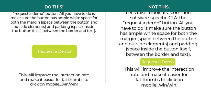
Let’s take a look at a common software-specific CTA: the “request a demo” button. All you have to do is make sure the button has ample white space for both the margin (space between the button and outside elements) and padding (space inside the button itself, between the border and text). This will improve the interaction rate and make it easier for fat thumbs to click on mobile…win/win!
Moral of the story? White space isn’t just empty space…it’s a powerful tool that’s both art and science. Maintaining optimum levels of white space in your page designs and creating a balance can mean the difference between having a brochureware website and having a highly effective marketing communications tool…and the benefit to you and your tech company is significant.