


Feeling like your B2B software or technology website is, well, a bit boring? You’re not alone…many marketing managers struggle with how to “spruce up” text-heavy pages without embarking on a total website redesign.
Here are our favorite tips for how to breathe life into an otherwise boring B2B website design. How many can you implement this week?
Avoid crappy stock photography
Stock photography has gotten a bad reputation in years past…and for good reason. Is the “teamwork” on your website a group of white dudes giving each other a high five? Is your “inspirational” image an older man in a suit standing on top of a mountain? If so, you’re officially in crappy stock photography territory.
To make your website less generic (and cheesy), look for photos that follow some of these design trends:
- Realistic (not overly beautiful) models with genuine expressions
- Interesting filters, light flares or out-of-focus techniques
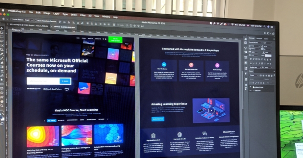
- Up-to-date technology (not computers from the 90s) with screenshots of your own software or website mocked-up on the monitor
Use simple icons
Icons are a quick and easy visual way to add interest to otherwise plain website text. For example, put small graphics next to each of your service areas: a lock to represent “security” or a cloud for “cloud computing” (duh). Same thing with the types of industries you serve: add a stethoscope for “healthcare,” a gavel for “legal,” etc.
Our favorite resource for icons? https://www.flaticon.com/
Break away from a monotone color palette
Technology companies loooove the color blue. But if your top nav bar, headings, buttons and footer are ALL blue, nothing is going to stand out. Develop a complementary color palette and use it (sparingly) on your site as a design accent.
The #1 place to use an accent color on your website? Buttons. Be sure people are visually drawn to the call-to-action on each page!
Call out important info
Is important or compelling info buried deep in the body copy of your website? Obviously, that’s bad. Take the extra time and call out pull quotes and ROI stats, since that’s what your reader ultimately cares about anyway.
Need specific examples? Include a headshot or company logo alongside client testimonials. Make ROI stats into simple graphs or charts using icons. Instead of simply stating that you have 28 data centers across the country, use a map with that many individual location dots. I could go on and on…
By making these simple visual updates to your website, you’ll be amazed at how much better a previously boring, text-heavy page can now look. And hopefully that will be just enough to get you through until a full website redesign is in the budget…fingers crossed for next year, right? (If you're not feeling DIY right now, Kiwi knows a thing or two about design.)
